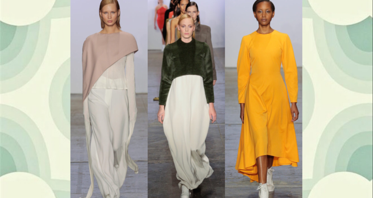
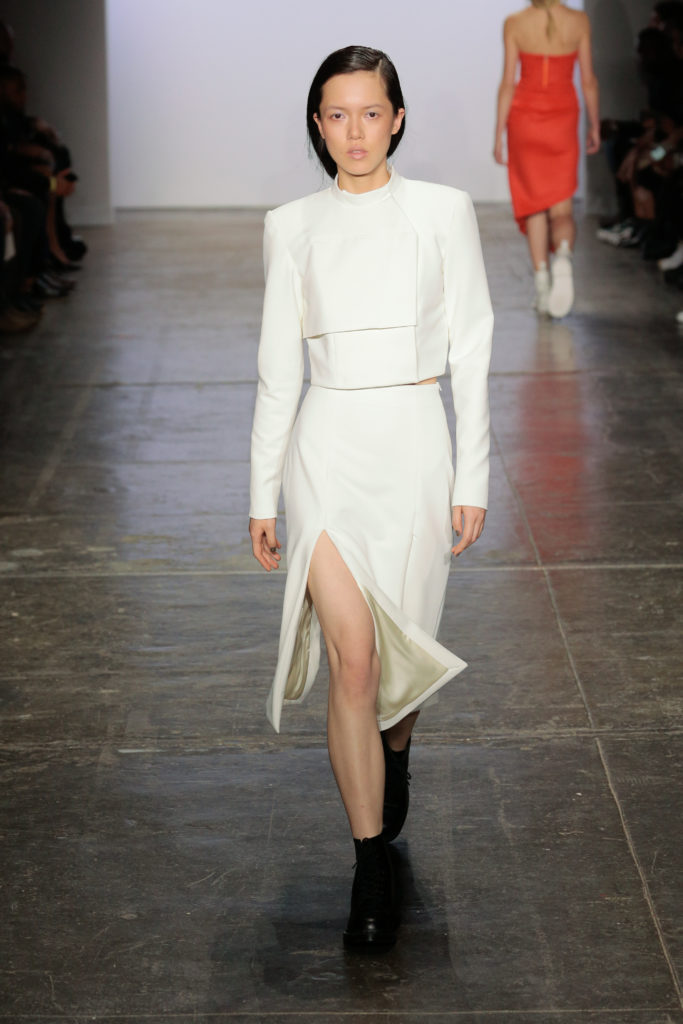
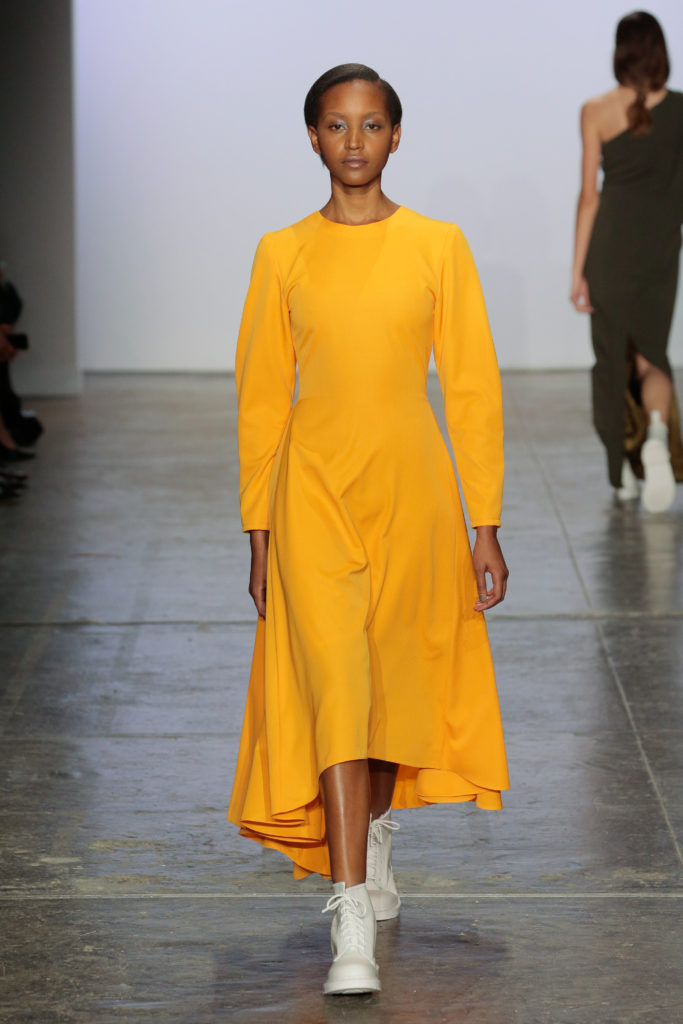
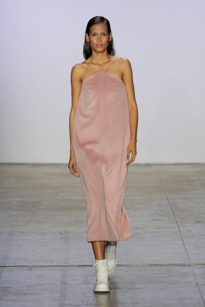
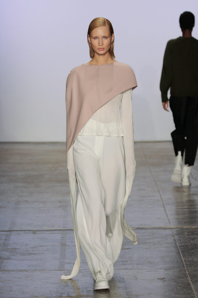
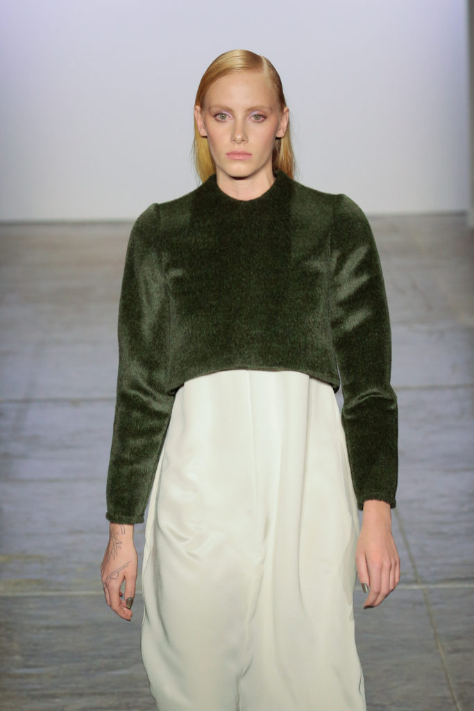
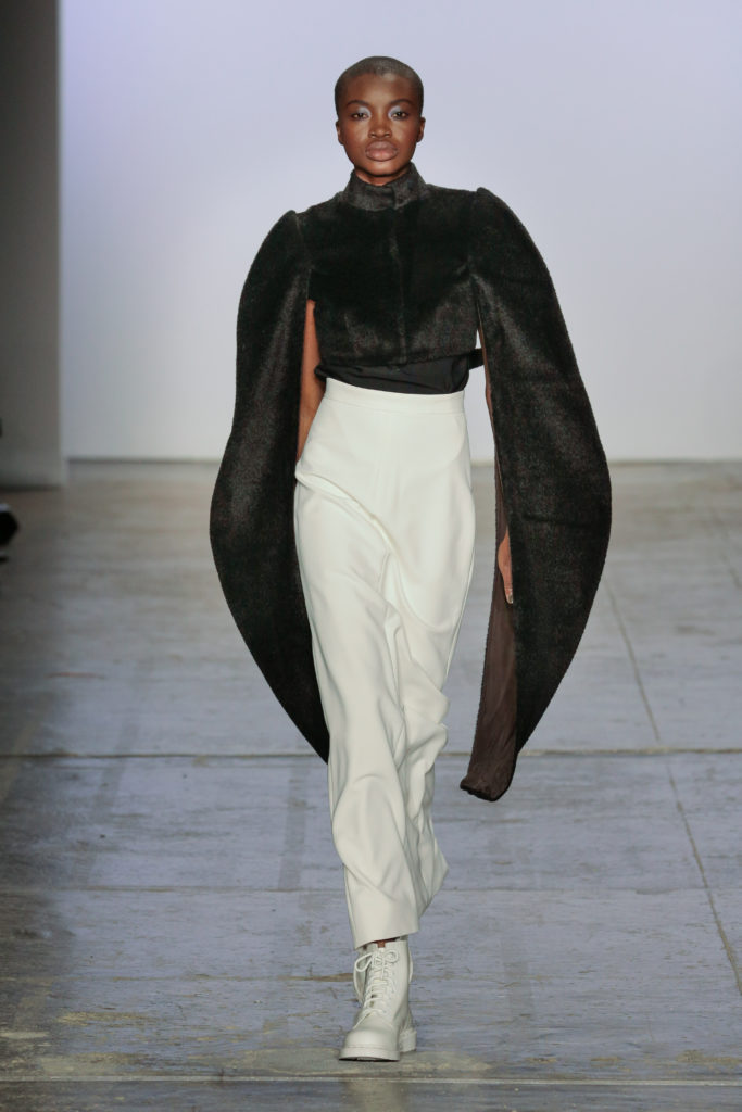
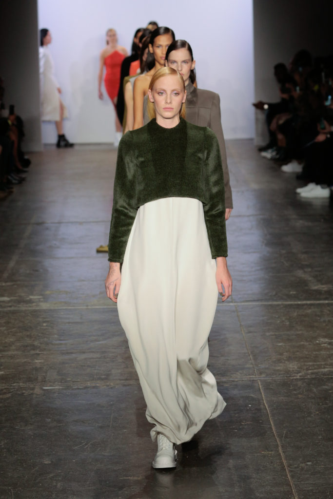
I had high hopes for this show. It was curated by none other than Kelly Cutrone, and one of the first people I saw upon arrival was Miss Jay Alexander. I was greeted by the noise of Garbage and Sonic Youth, also promising (though not the mood-setter I would’ve picked for such a high class crowd). However, when the show started, I wasn’t sure what to think. All of the pieces were monotone and made of fabrics that looked too stiff to offer much mobility. As far as design went, I was reminded of the store Muji: everything was beautiful, but maybe that’s only because how can something so basic be ugly?
Björk was the first artist played when looks came out, which seemed odd to accompany such bland clothing. Björk to me has always represented the weird and the strange; she belongs with swan dresses and crystal face masks, so why pair her with the McLaughlin collection? The only reason I could think of was the same reason they’d play Shirley Ann Manson and Kim Gordon: it’s easier to play the soundtrack of subculture than actually research and appeal to that subculture. The McLaughlin collection stole small bits and pieces from both grunge and middle class fashion, but didn’t have the decency to mimic their original wear. Unlike the infamous Marc Jacobs grunge collection, this runway refused to attempt the aesthetic of that which they stole; it merely sanitized it and paired it with a preliminary soundtrack that featured the most obvious alternative songs.
I kept watch for a piece that would offer something I hadn’t seen before, but everything seemed overdone or too basic to portray modernity. The collection would make a great uniform selection for an updated Star Trek episode.
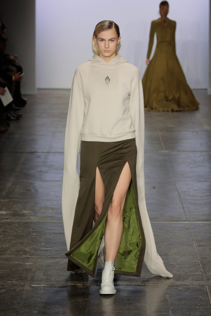
I couldn’t help but notice the shoes: all white and sterile. These shoes were not made for walking. They were purely ornamental. Some shoes were sneakers, though not practical enough for running, and some were rip off Doc Martens, though not practical enough for a punk show. I looked down at my own second hand, scuffed Docs and wondered if my shoes could ever be considered in the same family as those on the runway. Sure, they shared prominent threading and a bulky silhouette, but mine were meant for city streets and DIY venues. McLaughlin’s were meant for, I don’t know, lounging? walking delicately on carpet? being photographed?
One model wore a hoodie. She was white (perhaps a black model could conjure too many images of Trayvon). There is already a long history of white fashion stealing and profiting from black fashion, and the hoodie is quickly becoming an iconic part of the Black Lives Matter movement. There are already articles and analyses written about the appropriation of the hoodie and what it means for white people to be able to wear them without fear of coming off as “thug.” I suggest that anyone reading this do some looking into that subject. In any case, the sleeves of this particular high fashion hoodie reached far past her hands. Despite hoodies’ typical use as mundane wear for mundane tasks, this hoodie could never be worn to a grocery store: how could you pick up apples and push a cart with those sleeves? The piece represented what porcelain skin represented in the early twentieth century, what purple fabric represented in classical society, what a bias cut dress represented in the 1930s: class, wealth, privilege. Whoever can realistically don this hoodie would never need their hands because they would never need work. This client is not a practical one; they are too rich for the mundane.
An easy rebuttal to the aforementioned would be that the collection is not meant to be worn practically. Maybe that could be true if the pieces weren’t so simple. This show seemed to harken back to days of yore when the art and fashion world was an exclusive club for the financially elite. The clothes weren’t avant-garde enough to be considered art. They were certainly wearable, just not by those who need access to their hands or use of dirty pavement. It may seem like I’m coming down too harsh, and maybe I am, but it’s hard to take in aesthetic for the sake of aesthetic when such a platform could be used for an actual thesis.
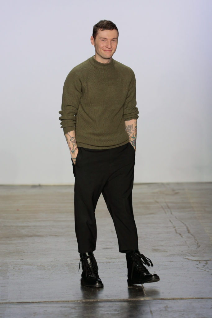
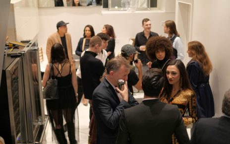
Immediately after the show, the audience flooded out the doors and waited on the curb for their Ubers. Meanwhile I started my trek to the subway station. I was acutely aware of my hole-spotted tights and clearance rack dress and second hand jackets. As Carrie Bradshaw was wont to say, I couldn’t help but wonder: was I truly the audience for this show? As a young girl who has yet to afford luxury of this caliber, I noticed the passé looks of the crowd towards Miss Jay and Kelly Cutrone. While I was ecstatic to be sharing a room with them, the rest of the audience seemed to feel perfectly at ease. This collection was undeniably beautiful (how can you critique design when it’s so basic there is nothing to take issue with?), but it was also undeniably meant for the upper crust of the upper crust. I was not Hogan McLaughlin’s “girl.” His “girl” would never thrift shop or wear hand-me-downs. She wears designers. His “girl” doesn’t take the Subway. She exclusively takes Ubers. His “girl” is not intimidated by celebrity. She is one.
It is quite possible that there was a piece of this collection that I’m missing. Maybe there was some sort of thought process beyond beauty that went into each piece. But overall, I felt like I had seen similar pieces before, and they certainly weren’t pieces worth rehashing. At a certain point, beauty becomes boring. Barring haute couture and avant-garde (which are more art pieces than anything else), fashion should consider utility. If designers ignore utility, they are subsequently ignoring those who work, those who must think of practicality, those who can’t afford such an expensive piece that could so easily be ruined by the mere act of living.
